
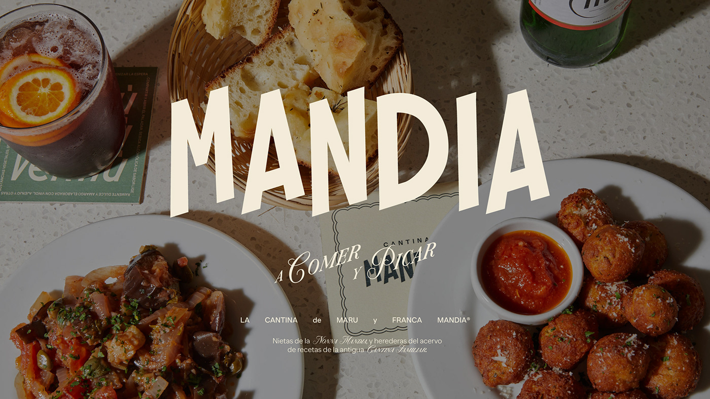
CANTINA MANDIA
Bs.As, Argentina. 2023
BRAND & CONCEPT
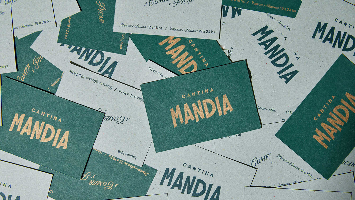
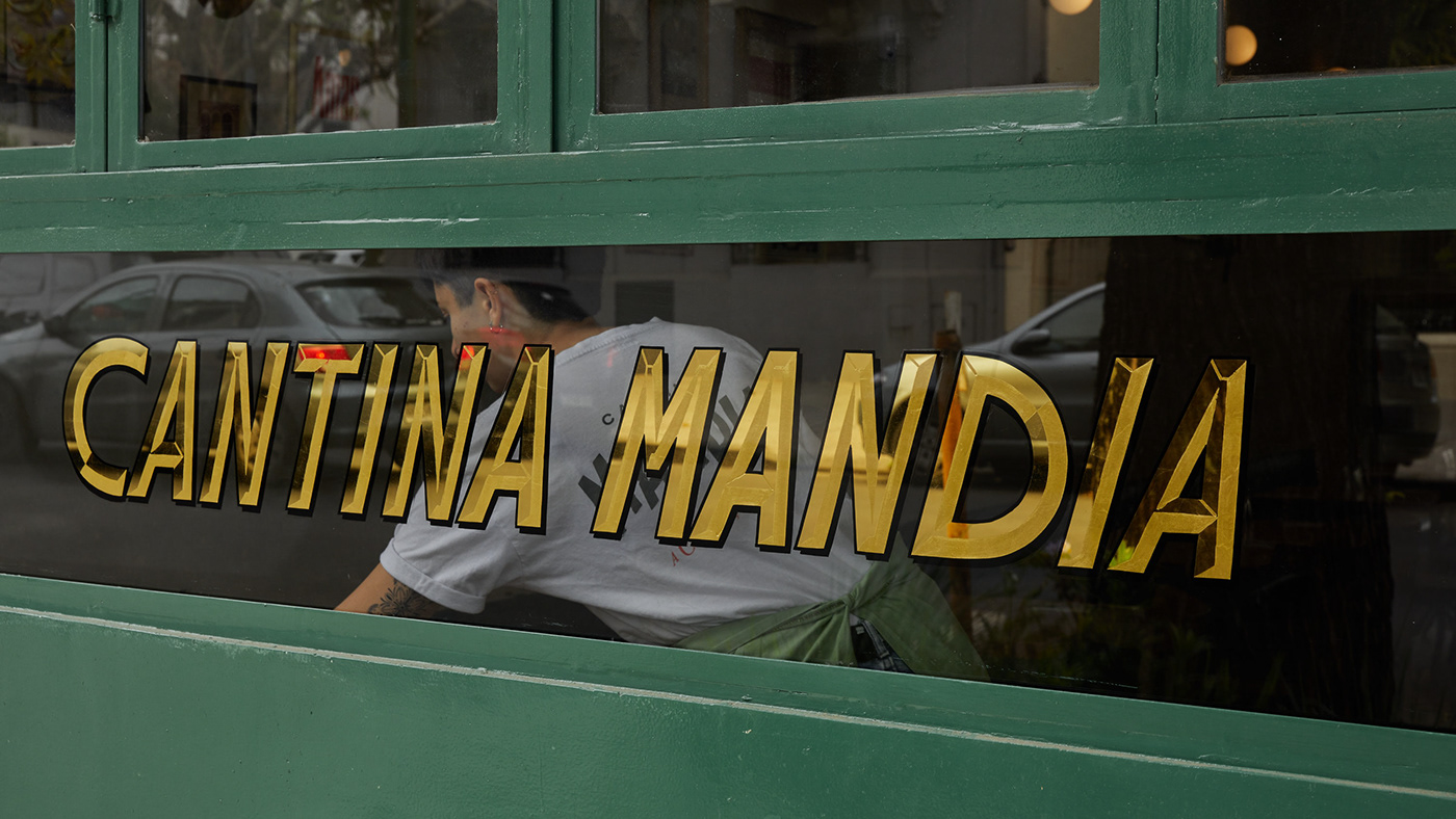
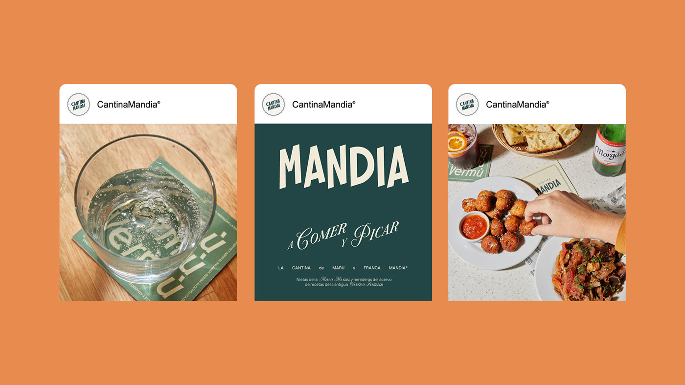
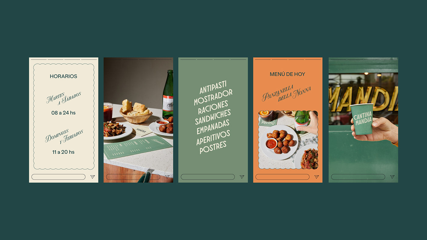
This branding was inspired by the frames of cinema in the 1960s era. The logo, based on a contemporary Art Deco typography, incorporates diagonal elements evoking the lively Italian spirit of Tarantella, with its vibrant voices, post-dinner conversations, and lively music. For the styling, we included photos of Sofia Loren related to food and leisure, and took the relaxed color palette from one of her images that combines an orange-golden hue to a great set of green tones. To introduce a feminine touch, we incorporated frames that remind us to the trimmings of folders and fabric napkins embroidered by grandmothers and added a script typography reminiscent of romantic movie titles. This blend of unique elements conveys the spirit of the era in a modern way.
SCOPE OF WORK
CREATIVE DIRECTION, ART DIRECTION, BRANDING, GRAPHIC DESIGN, PHOTOGRAPHY


Creative Direction Ufficio Studio
Graphic Design Sofía Noceti & Crista Bernasconi
Project Manager Carolina Corti
PH María Eugenia Solla
PH Assistant Alejandro Chen
Graphic Design Sofía Noceti & Crista Bernasconi
Project Manager Carolina Corti
PH María Eugenia Solla
PH Assistant Alejandro Chen
Font Molitor from 205.tf
Banana Grotesk from Monkey Type
Banana Grotesk from Monkey Type


